
To boost guest flow with wayfinding signage, focus on clear, simple signs placed at key decision points like entrances and intersections. Use high-contrast colors, universal symbols, and landmarks for instant understanding. Incorporate digital and interactive options for real-time updates, and guarantee signs are accessible for everyone. Regularly evaluate placement and update signs based on visitor feedback. Keep exploring for more tips to create an intuitive, welcoming environment that guides guests effortlessly through your space.
Key Takeaways
- Strategically place signs at key decision points to guide visitors efficiently and reduce confusion.
- Use clear, high-contrast visuals and universal symbols for quick understanding across diverse audiences.
- Incorporate landmarks and color-coding to enhance recognition and streamline navigation.
- Regularly assess and adjust signage placement based on visitor feedback and flow data.
- Utilize digital and interactive signage for real-time updates and personalized directions to improve flow.
Understanding the Importance of Effective Wayfinding
Effective wayfinding is essential because it directly impacts how easily people can navigate a space. When signage is clear and intuitive, you help visitors find their way quickly, reducing frustration and confusion. Good wayfinding guides people smoothly from one point to another, creating a seamless experience that encourages longer stays and positive impressions. Conversely, poor signage can lead to missed destinations, delays, and even safety hazards. It’s not just about avoiding confusion; effective wayfinding enhances safety, accessibility, and overall efficiency. When you prioritize clear signage, you’re making your space more welcoming and user-friendly. Ultimately, understanding the importance of effective wayfinding means recognizing that well-designed signage is crucial for guiding, informing, and engaging your visitors effectively. Clear and well-lit signage also contributes to the safety of electric heated mattress pads, ensuring users are aware of safety features and proper usage.
Key Elements of Successful Signage Design
Designing successful signage involves focusing on several key elements that guarantee your message is clear and easily understood. First, use simple, concise language so guests quickly grasp the information. Second, choose high-contrast colors to ensure visibility from a distance. Third, incorporate universal symbols and icons, reducing language barriers. Fourth, select legible fonts with appropriate size to enhance readability. These elements work together to create signage that’s immediately effective, guiding visitors smoothly through your space. Keep signage uncluttered, and prioritize consistency in style and messaging for a professional look. When you pay attention to these key elements, your signage becomes a powerful tool for improving guest flow and overall experience. Additionally, selecting reliable alarm clocks can help ensure staff and guests stay punctual, enhancing overall efficiency.
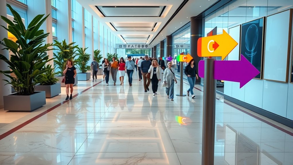
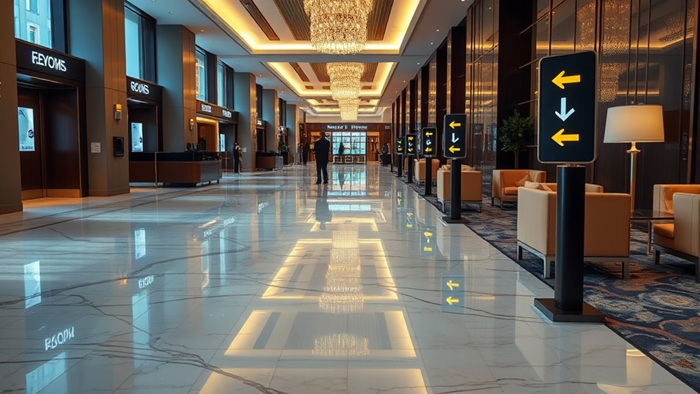
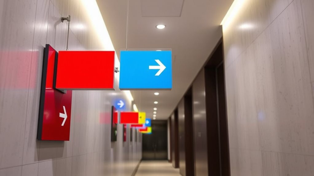
Strategically Placing Signs for Maximum Impact
Where you place your signs can make all the difference in guiding visitors smoothly through your space. Position signs at key decision points, such as entrances, intersections, and changes between areas. Keep signs at eye level to guarantee visibility and avoid clutter, which can confuse guests. Use clear sightlines; don’t hide signs behind furniture or fixtures. Place directional signs ahead of turns or complex areas so visitors have time to process the information. Consider foot traffic flow — high-traffic zones deserve prominent, well-lit signage. Additionally, minimize signage overload; too many signs can overwhelm or distract. Regularly assess the placement’s effectiveness, adjusting as needed based on visitor feedback or observed bottlenecks. Thoughtful placement ensures your signage guides guests naturally, enhancing their experience and streamlining flow. Being aware of guest behavior can help you optimize sign placement to better match how visitors navigate your space.
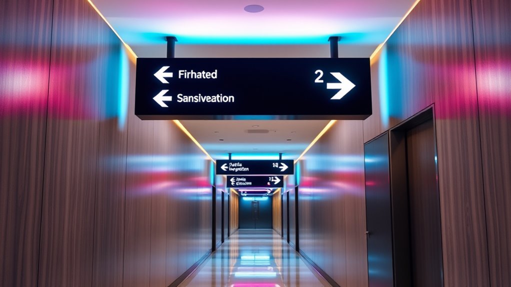
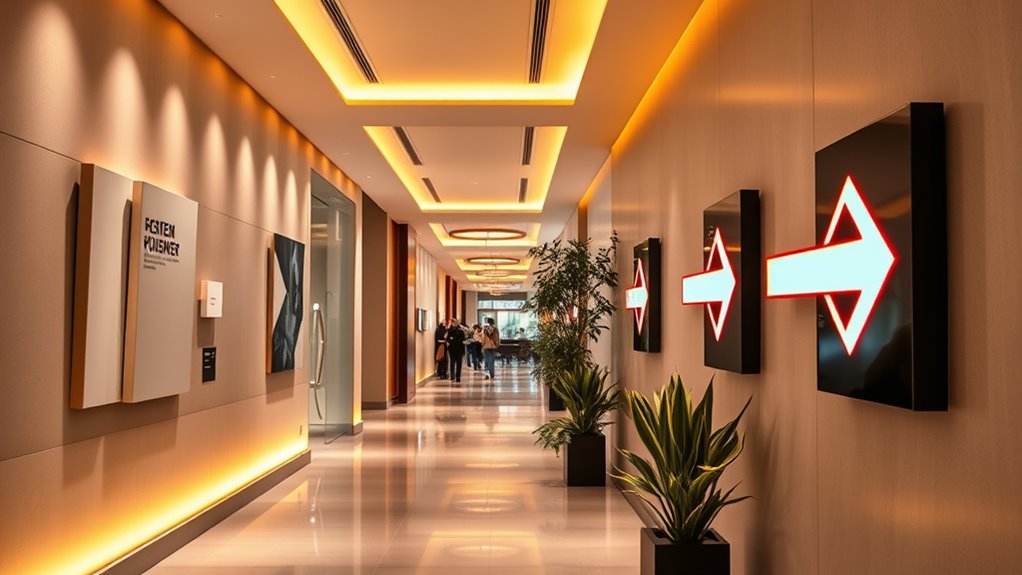
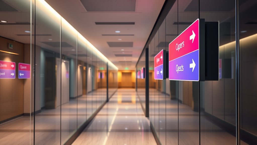
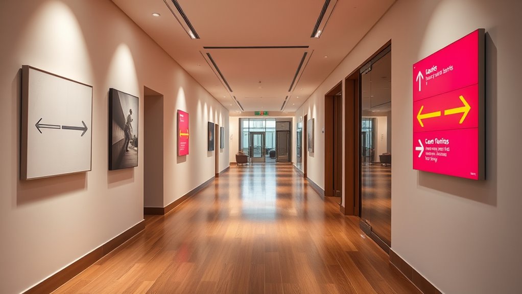
Utilizing Visual Cues to Guide Visitors
Visual cues are powerful tools that can subtly direct visitors along your desired path. They catch the eye and influence movement without overwhelming the environment. To effectively utilize these cues: 1. Use color contrasts to highlight key pathways or entrances, making them stand out instantly. 2. Incorporate directional symbols and arrows to guide visitors intuitively. 3. Employ lighting to draw attention to specific areas or signs, especially in low-light settings. 4. Place visual markers, like footprints or footprints patterns, to lead visitors naturally through different zones. Additionally, incorporating ambiance elements such as warm lighting and cozy decor can create a welcoming atmosphere that encourages visitors to explore further.
Incorporating Digital and Interactive Signage Options

Building on the power of visual cues, incorporating digital and interactive signage options can substantially enhance visitor engagement and wayfinding efficiency. Digital signs offer real-time updates, guiding guests smoothly through changing conditions or events. Interactive displays allow visitors to search for specific locations, access detailed maps, or receive personalized directions, reducing confusion and frustration. You can install touchscreen kiosks at key decision points to provide instant, relevant information. Furthermore, digital signage can be programmed to display multilingual content, catering to diverse audiences. These tools make the experience more dynamic and adaptable, helping guests navigate complex spaces more confidently. Audience diversity and the ability to cater to multilingual needs make digital signage an essential component of modern wayfinding. When integrated thoughtfully, digital and interactive signage transforms static wayfinding into an engaging, responsive experience that keeps visitors informed and moving efficiently.
Ensuring Accessibility and Inclusivity in Signage
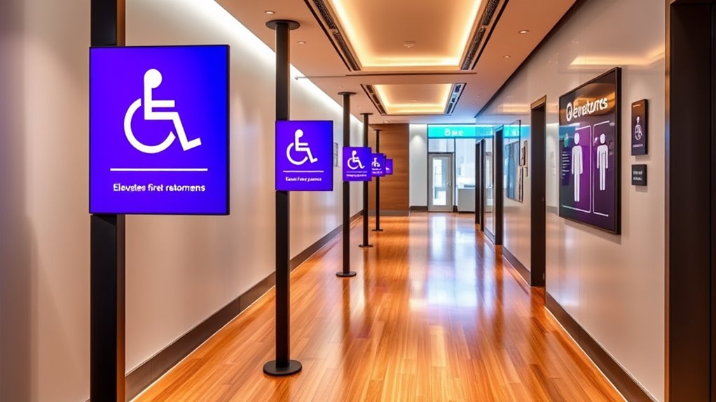
To guarantee everyone can navigate your space effectively, designing signage that prioritizes accessibility and inclusivity is essential. First, use high-contrast colors to ensure readability for those with visual impairments. Second, incorporate large, clear fonts that are easy to read from a distance. Third, include universal symbols and pictograms that transcend language barriers. Fourth, ensure signs are placed at accessible heights and locations, avoiding obstructions. By implementing these strategies, you create an environment where all guests feel welcomed and able to find their way effortlessly. Prioritizing accessibility not only complies with legal standards but also enhances the overall guest experience, making your space more inclusive and user-friendly for everyone. Additionally, considering mindful design principles can help you create signage that reduces visual clutter and promotes clarity.
Monitoring and Updating Signage for Continuous Improvement
How often do you review your signage to guarantee it remains effective and relevant? Regular inspections help identify outdated or confusing signs, ensuring smooth guest flow. You should analyze visitor feedback, observe navigation patterns, and monitor traffic flow to spot issues. Updating signage promptly maintains clarity and engagement. Consider factors like changes in layout, branding, or visitor demographics. To guide your review process, use this table:
| Review Focus | Action Items |
|---|---|
| Visitor Feedback | Collect and analyze comments regularly |
| Traffic Patterns | Observe and adapt signage placement |
| Sign Condition | Repair or replace damaged signs |
| Relevance of Content | Update information for accuracy |
Additionally, staying informed about lifestyle trends can help tailor signage to better connect with your audience. Consistent monitoring guarantees your signage evolves with your guests’ needs, boosting overall guest experience.
Case Studies of Effective Wayfinding Solutions
Real-world examples demonstrate how effective wayfinding solutions can substantially improve visitor experiences. For instance, a major museum redesigned its signage, reducing visitor confusion and increasing engagement. Here are some successful cases:
- A zoo implemented clear, color-coded pathways. Visitors navigated easily and spent more time at exhibits.
- An airport added digital wayfinding kiosks. Travelers found gates faster, reducing stress and congestion.
- A shopping mall used bold, directional signs with landmarks. Customers moved smoothly between stores and amenities.
- A hospital installed intuitive signage with symbols and maps. Patients and visitors found departments quickly, improving satisfaction.
- Applying principles of cost behavior analysis can help optimize signage investments by understanding which improvements yield the best flow outcomes.
These solutions show how targeted signage can enhance flow, reduce frustration, and create a positive environment for all guests.
Frequently Asked Questions
How Can Signage Influence Guest Behavior and Decision-Making?
Signage plays a vital role in guiding guest behavior and decision-making. When you use clear, visible signs, you help guests navigate easily, reducing confusion and frustration. Strategic placement of signs influences their choices, encouraging them to explore more or follow desired pathways. Bright, concise signage also captures attention, shaping perceptions and actions. Ultimately, effective signage enhances their experience, making their journey smoother and more enjoyable.
What Are Common Mistakes to Avoid in Signage Design?
You want effective signage, so avoid clutter and confusing visuals that can overwhelm guests. Don’t use small fonts or poor contrast, which make signs hard to read. Steer clear of inconsistent styles or placement that create confusion. Remember, simplicity is key—use clear, direct language and intuitive icons. By avoiding these mistakes, you guarantee your signs guide guests smoothly, enhancing their experience and improving overall flow.
How Do Weather Conditions Affect Outdoor Signage Effectiveness?
Weather conditions can considerably impact outdoor signage effectiveness. Rain, snow, wind, and sunlight may cause damage, fading, or obscuration, making your signs hard to see or read. You should choose durable materials, use protective coatings, and guarantee proper placement to minimize weather-related issues. Regular maintenance is essential to keep signs visible and functional, so your guests can navigate easily regardless of the weather.
What Budget Considerations Are Involved in Signage Implementation?
Imagine you’re planning a new signage system for your outdoor space. Your budget must cover design, materials, installation, and maintenance. For instance, choosing durable, weather-resistant signs costs more initially but saves money long-term. You should also consider ongoing expenses like replacements or updates. By balancing quality with affordability, you guarantee effective wayfinding without overspending, ultimately enhancing guest experience and operational efficiency.
How Can Staff Be Trained to Support Wayfinding Efforts?
You can train staff by providing extensive guides on signage locations and purpose, ensuring they understand how to assist guests effectively. Role-playing scenarios help staff practice guiding visitors, and regular updates keep them informed about new signage or changes. Encourage proactive engagement, so staff feel confident directing guests. Ultimately, well-trained staff serve as an extension of your signage, enhancing guest flow and creating a seamless experience.
Conclusion
Effective wayfinding guides your guests seamlessly, enhancing their experience and boosting flow. While some may think signs are just simple directions, the right design and placement truly transform navigation. Don’t underestimate their power—you’ll see better visitor satisfaction and smoother operations. Keep signs fresh and inclusive, and you’ll create a welcoming environment that encourages exploration. Remember, clear guidance isn’t just about signs; it’s about making every guest feel confident and comfortable in your space.