TL;DR

Get kitchen staples and gadgets delivered free with Prime
- Fast, free delivery on millions of items
- Prime Video, Amazon Music and more included
- Member-only deals all year
Ina Garten’s decorating advice, highlighted in a Good Housekeeping report, is to choose a small color palette for items displayed in the kitchen. She suggests white china and silver, while also recommending a mix of shapes, heights, and old and new pieces.
Ina Garten’s kitchen decorating tip is to choose a small color palette and stick with it, such as white china and silver, according to a Good Housekeeping report citing a post on her Substack. The advice offers a low-cost way to make displayed dishes and serving pieces feel more coordinated without replacing cabinets or buying a new collection.
Garten’s recommendation is about the items visible in a kitchen, not a requirement to redesign the room. The Good Housekeeping report says people can apply the idea by selecting a few complementary colors among the pieces they already display. White and silver are one example; the palette can be adapted to suit a household’s own preferences.
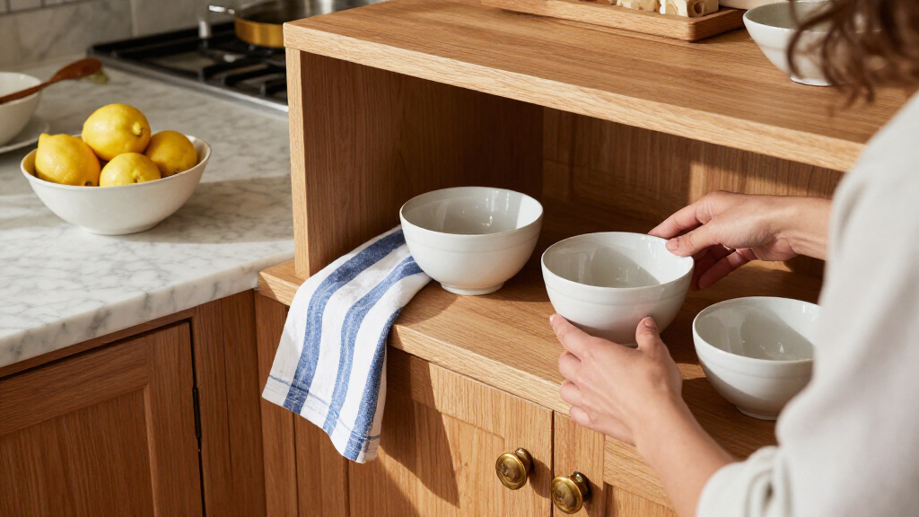
The report notes that Garten’s social media images have included a creamy Dutch oven and muted bowls alongside silver cake stands and pitchers. That combination illustrates the palette, but the article’s central advice is broader: keeping colors limited can help a collection of kitchenware look cohesive even when its pieces vary.
Garten also advises mixing old and new items and arranging pieces of different shapes and heights. In the Substack guidance quoted by Good Housekeeping, she says, “Choose different shapes—round, flat, plus different heights—to sit next to each other.” The report adds her suggestion to display dishes and trays that are both useful and loved, rather than treating kitchen shelves as purely decorative.
A Cohesive Look Without Replacing Everything
The appeal of the advice is its modest scale: it focuses on organizing and displaying existing kitchenware, rather than buying a matching set or undertaking a renovation. For readers who keep dishes, trays, or serving pieces in view, a limited palette can provide a visual link among objects collected at different times.
The approach also allows for variation. Garten’s suggestions do not require identical plates or a perfectly uniform display. Different forms, materials, and heights can remain part of the arrangement, while a shared color family helps it feel considered. That is useful for households that replace items gradually or own a mix of inherited, practical, and newer pieces.
These are decorating recommendations, not a guarantee that a kitchen will look timeless or suit every home. The report presents white and silver as a classic example and frames the result as a matter of personal style. Readers can use the underlying principle—limiting colors—without adopting Garten’s exact combination.
As an affiliate, we earn on qualifying purchases.
Garten’s Advice on Displaying Kitchenware
Good Housekeeping’s report draws on Garten’s Substack for the color-palette recommendation and further display advice. It describes her accessible approach to cooking and home design as a source of inspiration, but the specific development is a published decorating tip, not a new product launch or formal design announcement.
The report says the white-and-silver pairing appears in Garten’s kitchen-related social media images. It also relays her view that useful objects can make a kitchen feel lived in. Garten wrote, “If you display dishes and trays that you actually use and love, your kitchen just feels alive.” The report connects that idea to open shelves and glass-front cabinets as ways to show a collection, though neither is necessary to use the palette advice.
For a more layered arrangement, Garten recommends placing older and newer pieces together and varying their shapes. She also suggests adding height by leaning a platter against a wall or including a stack of cookbooks or a wireless table lamp. These are optional styling ideas, rather than conditions for following the color tip.
No One-Size-Fits-All Palette
The report does not identify a specific kitchen renovation, product, or new design project connected to Garten’s advice. It also does not provide measurements or evidence comparing how different palettes affect the appearance of a kitchen. The recommendation is presented as a styling principle, not a tested design rule.
It remains a matter of individual taste whether white and silver, or another limited palette, will suit a particular home. The source does not set out a required number of colors or a fixed arrangement, and it does not say that open shelving or glass-front cabinets are needed.
A Tip Readers Can Try at Home
No further announcement or follow-up milestone is identified in the source material. Readers can try the suggestion by grouping a few pieces already on display by color, then varying their shapes and heights. The report’s guidance is to use items that are functional and personally valued, and to treat additions such as cookbooks, a leaned platter, or a lamp as optional.
Whether the arrangement feels right will depend on the kitchen and its owner’s preferences. Garten’s advice leaves room to adjust the palette over time rather than requiring a full set of matching accessories.
Key Questions
What is Ina Garten’s kitchen decorating tip?
Garten recommends choosing a small color palette for displayed kitchen items. White china and silver are the example quoted in the Good Housekeeping report.
Do I need to buy new dishes to use the idea?
No. The report says the approach can be applied to pieces you already own by choosing a few complementary colors for items on display.
Does Garten recommend matching every dish?
No. Her advice includes mixing old and new pieces and varying shapes and heights, rather than arranging only identical bowls or plates.
How can I add variety to a white-and-silver display?
Garten’s suggestions, as reported by Good Housekeeping, include leaning a platter against a wall or adding a stack of cookbooks or a wireless table lamp. These are optional ways to add height.
Source: rss
NFL season / tailgating Picks
team gear
As an affiliate, we earn on qualifying purchases.