When designing a menu, focus on aligning layout with natural eye movement patterns like the F-shape or Z-shape scans to guide customer attention efficiently. Use contrasting colors and strategic positioning of high-profit items along these natural paths to draw focus. Keep the design clean and organized, minimizing clutter to facilitate quick decisions. Incorporate visual cues and whitespace to enhance focus and flow, helping your customers find what they want effortlessly—learn more about creating effective menus that boost sales.
Key Takeaways
- Design menus using eye-tracking principles like F-shape or Z-shape to guide natural visual flow.
- Position high-margin or featured items along key eye movement paths for better visibility.
- Use whitespace strategically to prevent clutter and direct attention to important menu sections.
- Apply contrast and visual cues to highlight specific items without disrupting overall layout.
- Arrange content with clear hierarchy, emphasizing headings and signature dishes for quick decision-making.
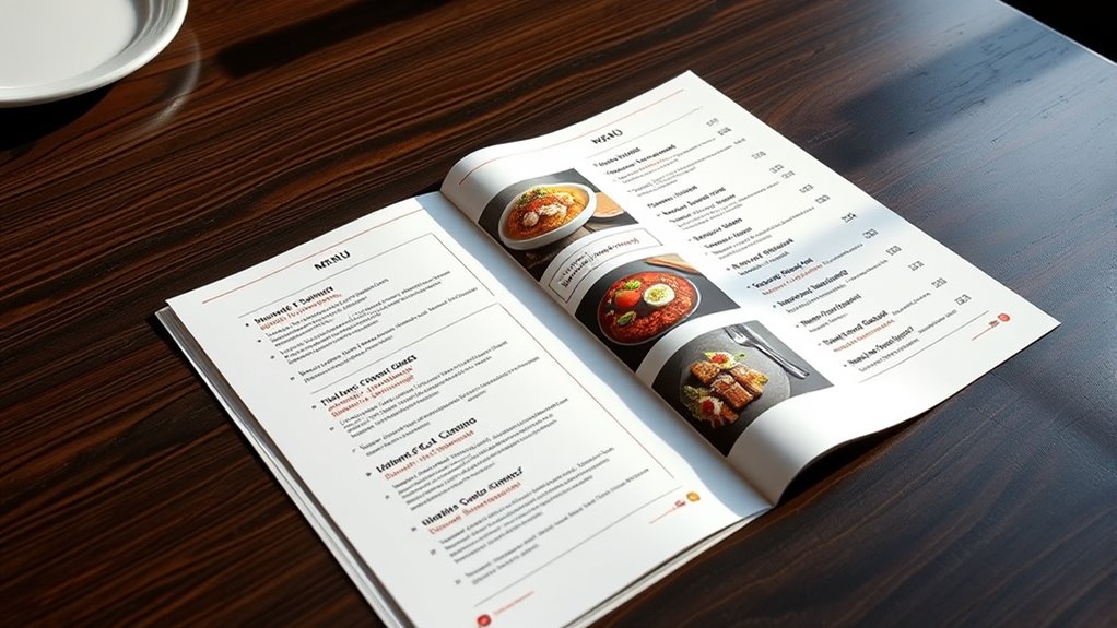
Creating an effective menu is essential for guiding your customers and boosting sales. When designing your menu, understanding eye-tracking and layout principles helps you direct attention exactly where you want it. Two key elements that influence how your menu is perceived are color psychology and font selection. These factors work together to create a visual flow that encourages customers to explore your offerings and make decisions more quickly.
Color psychology plays a significant role in shaping customer perceptions and emotions. Bright, warm colors like red and orange can stimulate appetite and create a sense of urgency, making them ideal for highlighting specials or high-profit items. Cooler tones like blue tend to evoke calmness and trust, which can be useful for promoting beverages or healthier options. As you choose your menu colors, think about the mood you want to create and how different hues can influence purchasing behavior. Strategically using contrasting colors also helps important items stand out, drawing the eye naturally to sections or dishes you want to promote.
Color psychology influences perceptions: warm reds boost appetite, blues evoke trust, and contrast highlights key items effectively.
Font selection is equally critical in guiding your customers’ eye movement across the menu. You want fonts that are easy to read at a glance, with clear, crisp lettering that doesn’t cause strain. Sans-serif fonts are often preferred for their modern, clean look and legibility, especially for main categories and item descriptions. Use larger or bolder fonts for headings or signature dishes to capture attention immediately. Avoid overly decorative or script fonts that can be hard to decipher quickly, as this can confuse or frustrate customers. Consistency in font style and size helps create a clean visual hierarchy, leading customers’ eyes smoothly from one section to the next without confusion. Additionally, understanding visual patterns like the F-shape or Z-shape scan can help optimize your layout for natural eye movement. The layout of your menu should follow natural eye-tracking patterns, which tend to scan in an F-shape or Z-shape pattern. Place your most profitable or featured items along these lines to maximize visibility. Position key items toward the top and the center of each section where the eye naturally falls. Use whitespace deliberately to prevent clutter, making it easier for customers to focus on individual items without feeling overwhelmed. Incorporating visual cues like boxes or icons can also help guide attention without disrupting the overall flow.
Frequently Asked Questions
How Does Cultural Background Influence Menu Layout Preferences?
Your cultural background shapes your menu layout preferences by influencing regional menu preferences and cultural symbolism. You tend to favor designs that reflect familiar symbols and traditions, making navigation intuitive. For example, vibrant colors or specific icons may resonate more with certain cultures. Understanding these preferences helps you create menus that feel personalized and inviting, ensuring customers connect with the cultural symbolism and regional elements that make your menu more appealing.
What Are the Latest Trends in Digital Menu Design?
Digital menu design is dynamically driven by daring updates and delightful details. You’ll notice trends like incorporating interactive elements that engage guests and enhance experience. Font readability remains vital, ensuring clarity and quick comprehension. Modern menus favor minimalistic layouts with vibrant visuals, seamless scrolling, and smart search features. These trends help you create engaging, convenient interfaces that invite customers to explore, order, and enjoy effortlessly.
How Can Menu Design Improve Customer Decision-Making Speed?
You can improve customer decision-making speed by creating a clear visual hierarchy that guides their eyes to popular or recommended items first. Use bold, legible fonts to enhance font readability, making it easy for customers to scan menus quickly. Group related items logically, and use contrasting colors to highlight key options. This streamlined approach helps customers find what they want faster, leading to quicker decisions and a better dining experience.
What Role Does Color Psychology Play in Menu Layout?
Colors are the silent conductors of your menu, guiding your customers’ emotional response like an invisible hand. By choosing the right color schemes, you evoke feelings that influence their choices—warm tones stir excitement, while cool shades evoke calm. You shape perceptions and decisions subtly, turning a simple list into an emotional journey. Harness color psychology wisely, and your menu becomes a powerful tool to steer customers effortlessly toward your best offerings.
How to Optimize Menus for Accessibility and Inclusivity?
To optimize menus for accessibility and inclusivity, focus on font readability by choosing high-contrast colors and legible fonts. Simplify menu navigation with clear labels and logical structure, making it easy for everyone to find what they need. Avoid clutter and use ample spacing, ensuring users with visual or motor impairments can navigate effortlessly. These steps create a more inclusive experience, ensuring all users can access your menu seamlessly.
Conclusion
Think of your menu as a well-lit path guiding customers effortlessly to their favorite dish. By understanding eye-tracking and layout principles, you become the mapmaker, directing attention where it matters most. With thoughtful design, you create a seamless flow that delights diners and boosts sales. Remember, a clear, engaging menu is your most trusted compass—leading guests on a flavorful journey they’ll want to revisit time and again.