
Understanding color psychology helps you create a dining space that influences mood, appetite, and social interaction. Use reds and oranges to energize the environment and encourage lively conversations, or opt for calming blues and greens for relaxation and focus. Bright colors can boost activity levels, while neutral tones provide comfort and versatility. Combining different hues thoughtfully enhances the overall atmosphere. Keep exploring to discover how to tailor your space for the perfect dining experience.
Key Takeaways
- Red and yellow stimulate appetite and energy, creating lively, social dining atmospheres.
- Blue and green promote relaxation and tranquility, ideal for calm, mindful eating environments.
- Neutral tones offer versatile, timeless backdrops that enhance natural textures and comfort.
- Bright colors like red and orange can increase dining pace and social interaction.
- Combining warm and cool hues allows customization of ambiance to suit desired mood and functionality.
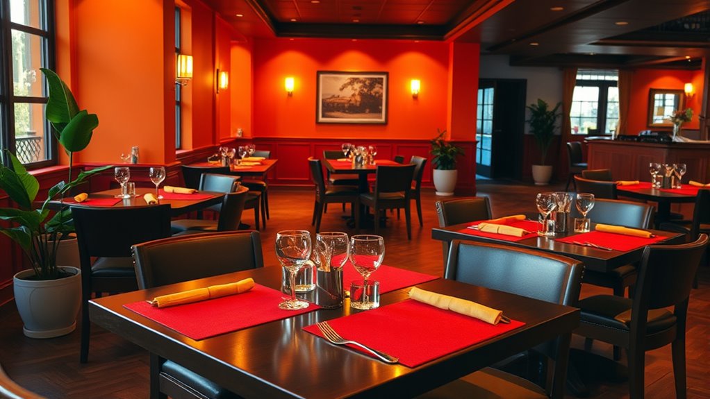
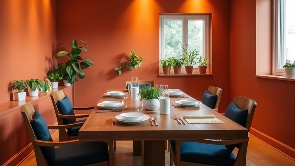
The Impact of Red on Appetite and Energy
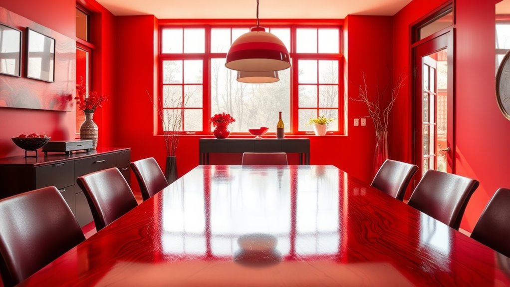
Red is a powerful color that can considerably influence your appetite and energy levels when used in dining spaces. It stimulates your senses, making food appear more appealing and encouraging quicker eating. This color can increase your heart rate, boosting your overall energy and alertness during meals. When you see red in a dining area, you might feel more excited and enthusiastic to eat, which is why many restaurants incorporate it into their decor. Additionally, red’s emotional impact can foster a lively and stimulating environment that encourages social interaction. However, too much red can become overwhelming or cause restlessness, so balance is key. Used thoughtfully, red creates an energetic atmosphere that promotes socializing and enjoyment. Its impact on appetite and energy makes it an effective choice for lively, inviting dining environments.
How Blue Creates Calm and Relaxation

Blue is known for its calming effects, making it an ideal choice for creating a serene dining environment. When you incorporate blue into your space, you promote relaxation and reduce stress, helping diners feel more at ease. Light, soft shades of blue evoke tranquility, encouraging a slower, more mindful eating experience. Blue also suppresses appetite slightly, which can be beneficial if you’re aiming for a peaceful atmosphere rather than a focus on heavy eating. Using blue in wall paint, tableware, or decor can transform your dining area into a restful retreat. This color’s cool undertones provide a sense of spaciousness and clarity, making your guests feel comfortable and unwound. Additionally, color accuracy in your decor ensures that the blue hues appear vibrant and true to life, enhancing the overall calming effect. Overall, blue fosters an environment where relaxation and conversation flourish naturally.
The Role of Yellow in Stimulating Happiness and Sociability

Yellow’s brightness can instantly lift your mood and make your dining space feel more inviting. It naturally encourages conversation and helps the energy flow more freely among guests. When used thoughtfully, yellow invites positive interactions and a sense of happiness. Incorporating space organization techniques can further enhance the overall ambiance, making your dining area not only cheerful but also functional and clutter-free.
Brightness Enhances Mood
When a space is brightened with yellow, it naturally lifts your spirits and encourages social interaction. Bright yellow walls or accents can make a dining area feel more inviting and energetic, positively affecting your mood. Light enhances the color’s cheerful qualities, creating an environment that feels lively and optimistic. This boost in mood helps you feel more relaxed and open during meals, making conversations flow more easily. A well-lit yellow space reduces feelings of stress and fatigue, promoting a sense of well-being. The brightness amplifies yellow’s natural ability to energize, making your dining experience more enjoyable. Additionally, incorporating sustainable practices in the design and lighting choices can further enhance the positive atmosphere of a yellow-themed space. Overall, increasing light levels in yellow-themed spaces helps foster happiness and enhances your overall dining mood.
Promotes Conversation Flow
Bright yellow in dining spaces naturally stimulates happiness, making people feel more sociable and enthusiastic to engage in conversation. This vibrant color encourages openness and warmth, helping guests feel comfortable sharing their thoughts. When you incorporate yellow, it creates a lively atmosphere that reduces social barriers, prompting more natural dialogue. Its energizing effect can keep conversations flowing smoothly, even when interactions start to lull. Yellow’s cheerful hue signals friendliness and positivity, making it easier for people to connect. As a result, dining spaces with yellow accents foster a sense of community, encouraging everyone to participate and interact more freely. Incorporating color psychology principles into your decor can further enhance these effects, creating an environment that actively promotes engaging conversations. If you want lively, engaging conversations at your table, adding touches of yellow can be a simple yet effective strategy.
Invites Positive Energy
Incorporating yellow into your dining space doesn’t just promote conversation flow—it actively invites positive energy that uplifts everyone present. Yellow is known for its cheerful, sunny vibe, which naturally boosts happiness and sociability. When you use yellow accents or walls, you create a warm, inviting atmosphere that encourages laughter and connection. Imagine a vibrant yellow table centerpiece paired with matching chairs, radiating warmth, or sunny window curtains that fill the room with light. Here’s a visual to help you picture it:
| Bright Yellow Accents | Uplifting Atmosphere |
|---|---|
| Sunny Wall Paints | Joyful Gatherings |
| Lemon-colored Decor | Energized Conversations |
| Golden Tableware | Positive Vibes |
Yellow truly energizes your space, making every meal a happy occasion. sound design techniques like ambient sounds and playful audio cues can further enhance this lively environment.
Green’s Effect on Freshness and Balance
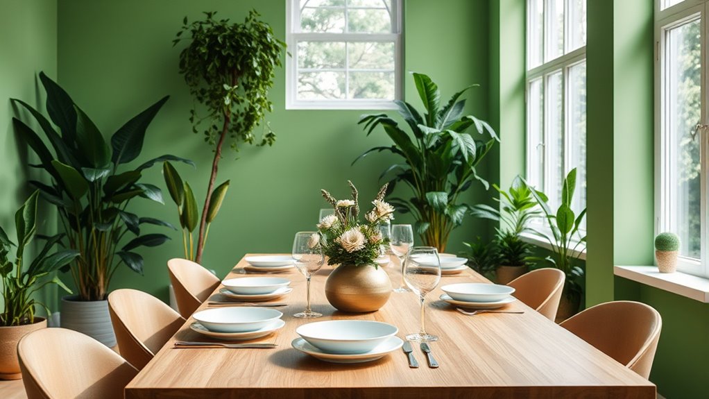
Green is often associated with freshness and harmony, making it a popular choice for dining spaces that aim to evoke a sense of balance. It energizes your environment while promoting relaxation, helping you feel more connected to nature. Green’s calming effect can reduce stress and create a soothing atmosphere, ideal for conversations and shared meals. Incorporating green can also stimulate appetite subtly, making food appear more appealing. To deepen its impact, consider these elements:
Green fosters harmony and relaxation, making dining spaces inviting and naturally appealing.
- Use natural materials like wood and plants to enhance authenticity
- Combine different shades of green for visual richness
- Pair green with neutral tones for a balanced look
- Incorporate botanical patterns to reinforce freshness
- Use soft lighting to highlight green accents and maintain tranquility
- Opt for Vetted options like the Flat Iron Bike to incorporate sustainable and eco-friendly elements into your space design.
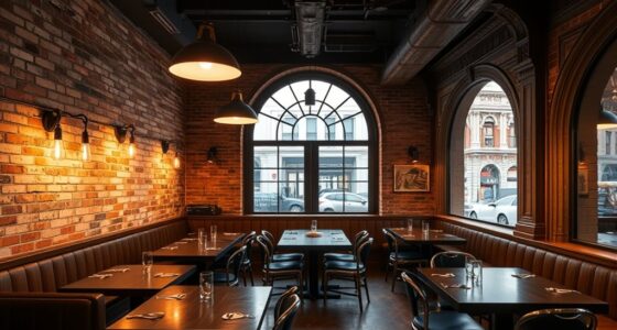
Black and Dark Colors for Sophistication and Elegance
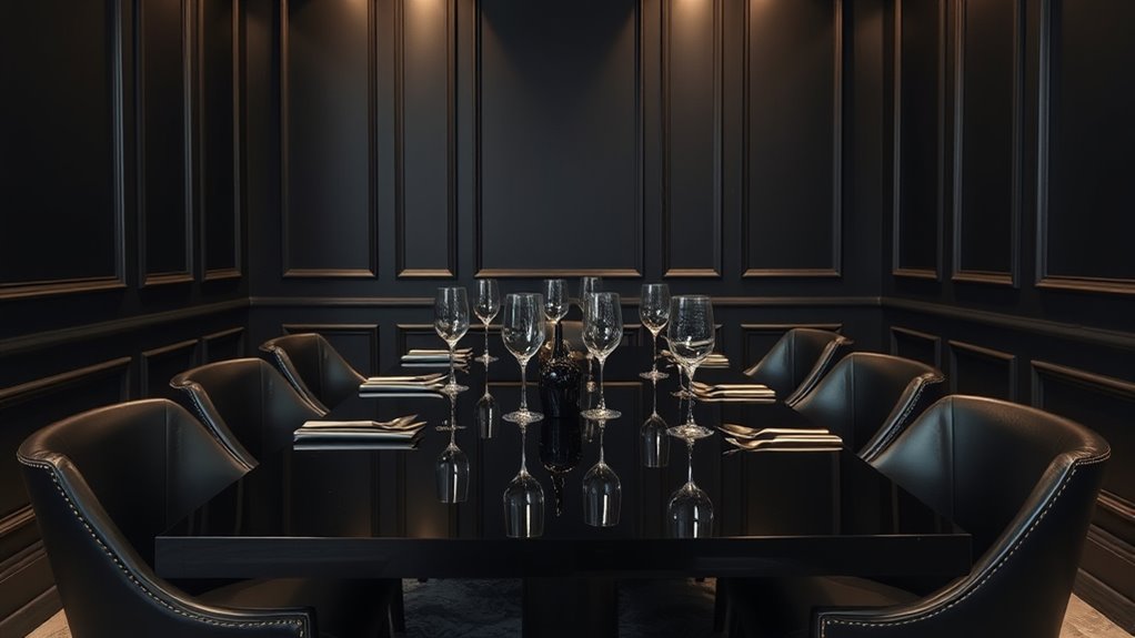
Dark colors like black and deep hues elevate the sophistication and elegance of your dining space. They create a luxurious, timeless atmosphere that commands attention and exudes confidence. When used thoughtfully, these shades can make your dining area feel more intimate and refined. To achieve this, consider pairing black or dark tones with metallic accents or crisp whites for contrast. Incorporating rustic decor elements can further enhance the farmhouse charm while maintaining a sophisticated ambiance.
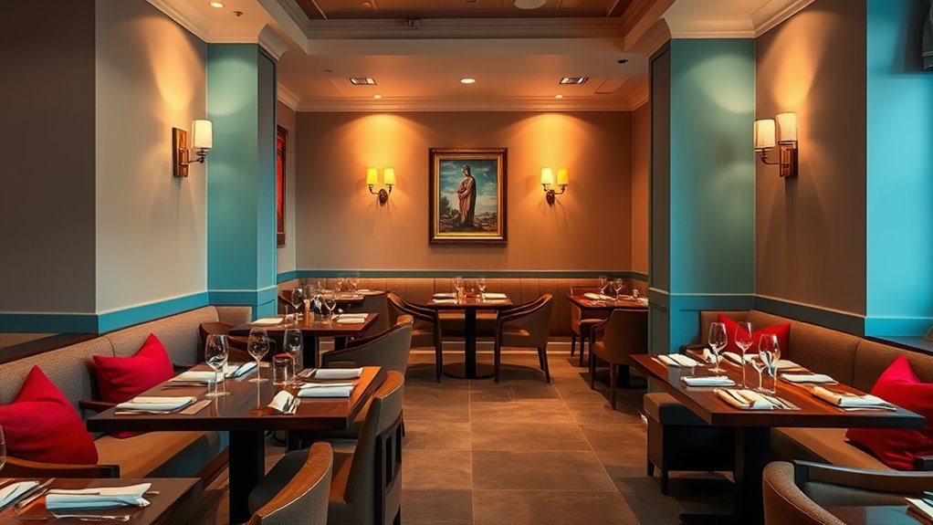
Neutral Tones for Versatility and Comfort
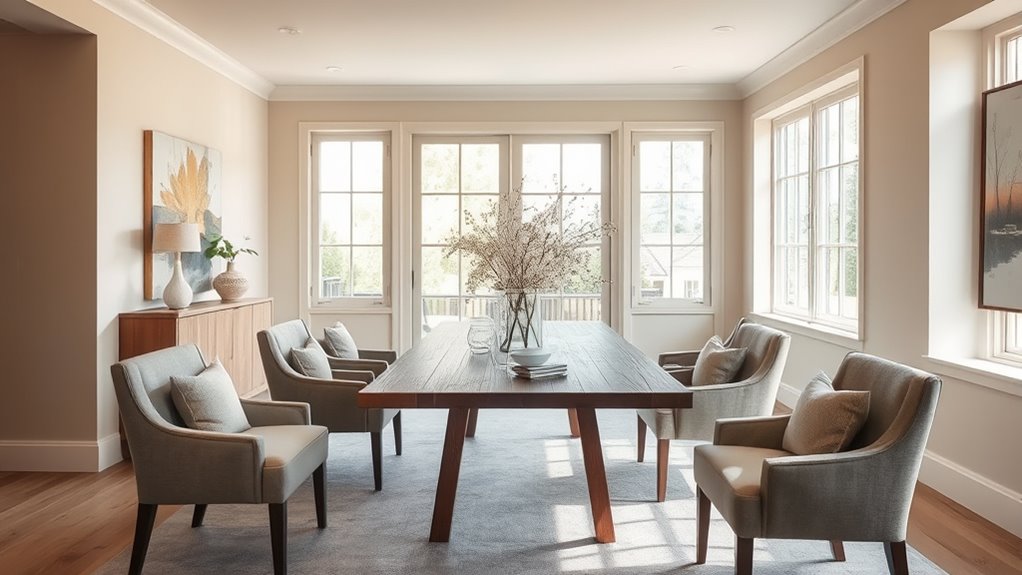
Neutral tones offer a versatile and inviting foundation for your dining space, seamlessly blending with various decor styles and color schemes. They create a calm, soothing environment that encourages relaxation and conversation. Using shades like beige, taupe, or soft gray allows you to add accents without overwhelming the senses. These tones also adapt easily to changes in decor or seasonal updates, making your space flexible and timeless. When you choose neutrals, you set a balanced backdrop that highlights textures and natural elements, enhancing overall comfort. Incorporating health-conscious design principles can further improve the well-being of those who dine in the space.
Bright Colors and Their Influence on Dining Pace
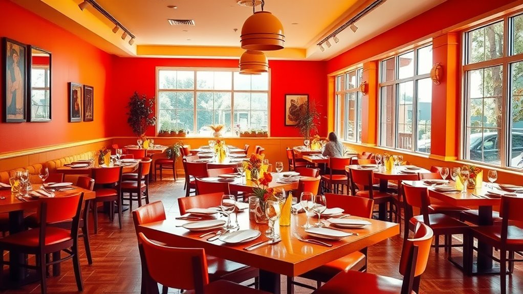
Vibrant colors can profoundly influence the energy and rhythm of your dining experience. Bright hues like red, orange, and yellow tend to stimulate your senses, encouraging quicker eating and increasing your overall pace. When you see bold colors, your brain often perceives the environment as lively and energetic, which can make you feel more restless or keen to finish your meal sooner. This effect is especially useful if you want to promote lively conversations or encourage guests to dine efficiently. However, too much brightness may make the space feel chaotic or overwhelming, causing discomfort or hurried eating. To strike the right balance, incorporate these colors thoughtfully, ensuring they energize your space without rushing your meal. Additionally, understanding color psychology can help you choose the most effective palette for your dining area.
Combining Colors to Enhance Ambiance and Perception
Combining different colors in your dining space allows you to craft an ambiance that influences perception and mood more effectively. By thoughtfully mixing hues, you can create a welcoming, energetic, or calming environment tailored to your needs. Consider pairing warm tones like reds and oranges with neutral shades to stimulate appetite while maintaining balance. Cool colors such as blues and greens can evoke tranquility, especially when combined with soft neutrals. The key is to select contrasting or complementary colors that reinforce your desired atmosphere.
- Balance vibrant shades with muted tones for harmony
- Use contrasting colors to highlight focal points
- Combine warm and cool hues to evoke complex feelings
- Layer different shades to add depth and dimension
- Match color combinations to the mood you want to create
Practical Tips for Applying Color Psychology in Dining Design
To effectively incorporate color psychology into your dining space, start by identifying the mood you want to create and selecting colors that support that atmosphere. If you aim for a calm, relaxing environment, opt for soft blues or greens, which promote tranquility. For a lively, energetic vibe, choose warm hues like reds and oranges that stimulate appetite and conversation. Keep in mind that balance is key—use bold colors as accents rather than overwhelming the space. Consider lighting, as it can alter how colors appear. Test paint samples before committing, and think about furniture and decor that complement your chosen palette. Finally, avoid overly busy patterns; simplicity allows your colors to truly influence the mood without distraction.
Frequently Asked Questions
How Do Cultural Differences Influence Color Perceptions in Dining Spaces?
Cultural differences considerably shape how you perceive colors in dining spaces. In some cultures, red might symbolize luck and energy, making it an inviting choice, while others see it as aggressive. You may find that blue feels calming in one place but cold in another. Your reactions are deeply influenced by cultural associations, so understanding these nuances helps you create more welcoming, culturally sensitive dining environments that resonate with diverse guests.
Can Specific Colors Improve the Overall Dining Experience for Different Age Groups?
Ever wondered if color can truly enhance your dining experience for different ages? You might be surprised to learn that warm hues like reds and oranges can stimulate appetite in younger diners, while calmer shades like blues and greens help older guests relax. By selecting colors thoughtfully, you create an inviting atmosphere tailored to each age group, making every meal more enjoyable. Isn’t it worth leveraging color to elevate your dining environment?
What Are the Best Color Combinations to Make a Small Dining Area Appear Larger?
To make your small dining area look bigger, you should use light, neutral colors like whites, soft grays, or pastels on the walls. Pair these with reflective surfaces such as glass or mirrors to enhance the sense of space. Keep furniture minimal and choose sleek, lightweight designs to avoid clutter. Using these combinations, you’ll create an open, airy feel that makes the space seem larger and more inviting.
How Does Lighting Interact With Wall Colors to Affect Mood and Appetite?
Sure, lighting is like that overenthusiastic friend who always overplays their part. It interacts with wall colors to set the mood and influence your appetite. Bright, warm lights can make your space feel cozy and inviting, encouraging you to linger and enjoy your meal. Conversely, cool, dim lighting might turn your dinner into a quick affair. So, choose your lighting to match your desired atmosphere and appetite goals.
Are There Any Colors That Should Be Avoided in Dining Areas for Health Reasons?
You should avoid very intense or overly bright colors like neon shades or deep reds, as they can cause eye strain or increase stress, negatively impacting your health and appetite. Extremely dark colors may make the space feel oppressive, leading to discomfort. Instead, opt for calming, neutral tones that promote relaxation and good health. Keep the environment balanced, ensuring colors support your well-being without overwhelming your senses.
Conclusion
Now that you know how colors influence mood and appetite, imagine transforming your dining space into an environment that perfectly balances energy, calm, and sociability. Will you choose bold reds to ignite passion, soothing blues for relaxation, or vibrant yellows to spark joy? The power to create an unforgettable dining experience is in your hands—just one color choice can change everything. Are you ready to discover the secrets of color psychology and elevate your space?